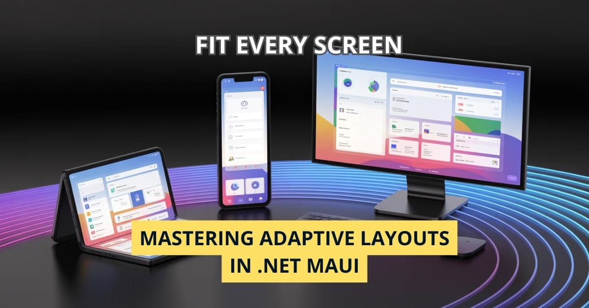
Ever polished your app on a phone emulator, hit F5 with a grin, and then watched horror‑struck as the very same UI sprawled like an oversized sticker on a large tablet—or worse, hid half its controls behind a desktop window’s edge? I’ve worn that battle‑scarred hoodie more than once, and I’m here to spare you the wardrobe.
.NET MAUI (Multi‑platform App UI) doesn’t just aspire to run everywhere; it gives you a toolbox to make every form factor feel purpose‑built. In this deep‑dive, you’ll learn pragmatic, copy‑paste‑ready techniques to tame screen‑size chaos, keep your designers happy, and—let’s be honest—look like the hero in your next sprint review.
Why Screen‑Size Optimization Still Matters in 2025
- Device Zoo Explosion – From foldables to ultrawide monitors, the “one‑size‑fits‑all” dream is still a fairy tale.
- App Store Rankings – Apple and Google both down‑rank apps that fail layout‑constraint tests.
- User Expectation Inflation – Users expect Instagram‑level polish everywhere, including their car dashboards.
- Accessibility & Compliance – Scalable UI is no longer nice‑to‑have; WCAG and EU regulations require it.
Bottom line: if your app doesn’t adapt, your churn rate will.
The Four Pillars of .NET MAUI Layout

- Containers –
Grid,FlexLayout,VerticalStackLayout,HorizontalStackLayout. - Adaptive Triggers –
VisualStateManager+StateTriggerBasederivatives. - Device Info Utilities –
DeviceDisplay.MainDisplayInfo,DeviceInfo.Idiom. - Dynamic Resources – Theme‑aware font sizes, spacing, and image densities.
Using these pillars in concert lets you cover 95 % of layout wrinkles without custom renderers.
Device Classes & Breakpoints

| Idiom | Typical DPI‑Independent Width | Common Use‑Case |
|---|---|---|
| Phone | 0 – 599 dp | Handheld portrait + quick landscape |
| Foldable (semi‑tablet) | 600 – 899 dp | Dual‑pane or spanned apps |
| Tablet | 900 – 1279 dp | Split‑view productivity |
| Desktop / Large Monitor | 1280 dp + | Resizable windows, ultrawides |
Tip: treat these breakpoints as guidelines, not gospel. Always test with real devices.
Strategy #1 – Adaptive Containers
<!-- HomePage.xaml -->
<Grid x:Name="RootGrid">
    <!-- Define columns BUT let VisualStateManager modify them later -->
    <Grid.ColumnDefinitions>
        <ColumnDefinition Width="*" />
        <ColumnDefinition Width="2*" />
    </Grid.ColumnDefinitions>

    <!-- Master pane -->
    <CollectionView x:Name="Menu" />

    <!-- Detail pane -->
    <Frame x:Name="Detail" Grid.Column="1" />
</Grid>
Inside the same XAML file we graft a VSM (VisualStateManager):
<VisualStateManager.VisualStateGroups>
    <VisualStateGroup x:Name="WidthStates">
        <VisualState x:Name="PhoneState">
            <VisualState.StateTriggers>
                <AdaptiveTrigger MinWindowWidth="0" MaxWindowWidth="599" />
            </VisualState.StateTriggers>
            <VisualState.Setters>
                <!-- Collapse menu into hamburger -->
                <Setter TargetName="Menu" Property="IsVisible" Value="False" />
                <Setter TargetName="Detail" Property="Grid.Column" Value="0" />
                <Setter TargetName="RootGrid" Property="ColumnDefinitions">
                    <Setter.Value>
                        <ColumnDefinition Width="*" />
                    </Setter.Value>
                </Setter>
            </VisualState.Setters>
        </VisualState>

        <VisualState x:Name="DesktopState">
            <VisualState.StateTriggers>
                <AdaptiveTrigger MinWindowWidth="1280" />
            </VisualState.StateTriggers>
            <VisualState.Setters>
                <!-- Classic two‑pane layout → menu always visible -->
                <Setter TargetName="Menu" Property="IsVisible" Value="True" />
            </VisualState.Setters>
        </VisualState>
    </VisualStateGroup>
</VisualStateManager.VisualStateGroups>
One XAML; infinite possibilities. No code‑behind gymnastics.
Real‑World Gotcha
AdaptiveTrigger fires once when the threshold is crossed. If the window is resizable, attach a SizeChanged event to re‑evaluate VSM manually.
protected override void OnAppearing()
{
    base.OnAppearing();
    this.SizeChanged += (_, _) => VisualStateManager.GoToState(this, GetSizeState(this.Width));
}
Strategy #2 – Orientation Awareness with IDeviceDisplay
When screen rotation still matters (tablets on stands, foldables):
void HandleOrientation()
{
    var orientation = DeviceDisplay.Current.MainDisplayInfo.Orientation;
    RootGrid.RowDefinitions.Clear();
    RootGrid.ColumnDefinitions.Clear();

    if (orientation == DisplayOrientation.Portrait)
    {
        RootGrid.RowDefinitions.Add(new RowDefinition(GridLength.Star));
        RootGrid.RowDefinitions.Add(new RowDefinition(GridLength.Auto));
    }
    else // Landscape
    {
        RootGrid.ColumnDefinitions.Add(new ColumnDefinition(GridLength.Auto));
        RootGrid.ColumnDefinitions.Add(new ColumnDefinition(GridLength.Star));
    }
}
Remember to unsubscribe from DeviceDisplay.MainDisplayInfoChanged to avoid memory leaks.
Strategy #3 – Dynamic Resource‑Driven Scaling
Define everything that looks like a pixel in App.xaml:
<Application.Resources>
    <ResourceDictionary>
        <x:Double x:Key="BaseSpacing">8</x:Double>
        <x:Double x:Key="FontSmall">12</x:Double>
        <x:Double x:Key="FontLarge">18</x:Double>
    </ResourceDictionary>
</Application.Resources>
Then piggy‑back on idiom:
public partial class App : Application
{
    public App()
    {
        InitializeComponent();
        double scale = DeviceInfo.Idiom switch
        {
            DeviceIdiom.Desktop => 1.2,
            DeviceIdiom.Tablet => 1.1,
            _ => 1.0
        };
        Resources["BaseSpacing"] = (double)Resources["BaseSpacing"] * scale;
        Resources["FontLarge"] = (double)Resources["FontLarge"] * scale;
    }
}
Voilà – consistent rhythm across screens, zero hard‑coded numbers.
Strategy #4 – Leveraging Shell’s Adaptive Flyout Behavior
Shell.FlyoutBehavior="Disabled" on ultrawide monitors? Foolish. Instead:
<Shell ...>
    <Shell.FlyoutBehavior>
        <OnIdiom x:TypeArguments="FlyoutBehavior"
                 Phone="Disabled"
                 Tablet="Flyout"
                 Desktop="Locked" />
    </Shell.FlyoutBehavior>
</Shell>
Users on desktop never have to hunt for navigation; phone users keep precious pixels.
Strategy #5 – CollectionView Stretch Magic
CollectionView defaults to ItemsLayout="VerticalList". A subtle tweak yields a Pinterest‑style grid on wide screens:
<OnIdiom x:TypeArguments="ItemsLayout"
         Phone="VerticalListItemsLayout"
         Tablet="GridItemsLayout Span=2"
         Desktop="GridItemsLayout Span=4" />
Keep that in your snippets folder.
End‑to‑End Example: Adaptive Dashboard in 40 Lines
Below is a condensed but productionalizable page that switches between single‑column (phone) and triple‑pane (desktop) automatically.
<ContentPage xmlns="http://schemas.microsoft.com/dotnet/2021/maui"
             xmlns:x="http://schemas.microsoft.com/winfx/2009/xaml"
             x:Class="AdaptiveDemo.DashboardPage">
    <Grid x:Name="Root" RowSpacing="{StaticResource BaseSpacing}" ColumnSpacing="{StaticResource BaseSpacing}">
        <Grid.RowDefinitions>
            <RowDefinition Height="Auto" />
            <RowDefinition Height="*" />
        </Grid.RowDefinitions>

        <!-- KPI Tile -->
        <Frame Grid.Row="0" Padding="{StaticResource BaseSpacing}">
            <Label Text="42" FontSize="{StaticResource FontLarge}" />
        </Frame>

        <!-- Chart Area -->
        <Frame x:Name="Chart" Grid.Row="1" />
    </Grid>

    <VisualStateManager.VisualStateGroups>
        <VisualStateGroup x:Name="WidthStates">
            <VisualState x:Name="Narrow">
                <VisualState.StateTriggers>
                    <AdaptiveTrigger MinWindowWidth="0" MaxWindowWidth="599" />
                </VisualState.StateTriggers>
                <VisualState.Setters>
                    <Setter TargetName="Root" Property="ColumnDefinitions">
                        <Setter.Value>
                            <ColumnDefinition Width="*" />
                        </Setter.Value>
                    </Setter>
                </VisualState.Setters>
            </VisualState>
            <VisualState x:Name="Wide">
                <VisualState.StateTriggers>
                    <AdaptiveTrigger MinWindowWidth="900" />
                </VisualState.StateTriggers>
                <VisualState.Setters>
                    <Setter TargetName="Root" Property="ColumnDefinitions">
                        <Setter.Value>
                            <ColumnDefinition Width="*" />
                            <ColumnDefinition Width="2*" />
                            <ColumnDefinition Width="*" />
                        </Setter.Value>
                    </Setter>
                    <Setter TargetName="Chart" Property="Grid.Column" Value="1" />
                </VisualState.Setters>
            </VisualState>
        </VisualStateGroup>
    </VisualStateManager.VisualStateGroups>
</ContentPage>
Copy, paste, impress.
Testing Across the Device Jungle
- .NET MAUI Community Toolkit
DevicePreview– Real‑time snapshots of every idiom and orientation. - Hot Reload + Live Visual Tree – Iterate at 2 × caffeine speed.
- CI Cloud Runners – Integrate App Center Test or BrowserStack to catch edge cases before your users do.
- Manual Sanity List – Keep a two‑column sheet: phone < 600 dp portrait, desktop 1920 × 1080; tick after each PR.
Performance Cheatsheet
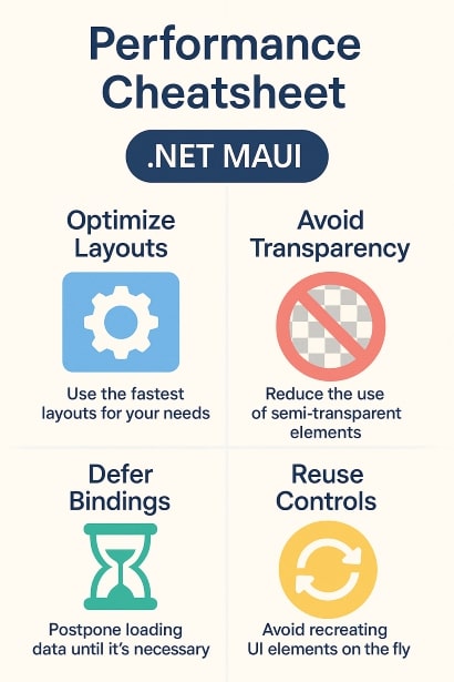
| Concern | Pitfall | Fix |
|---|---|---|
| Excessive Triggers | Multiple AdaptiveTriggers per state | Consolidate into single custom trigger |
| Measurement Loops | LayoutPass multiplied by orientation swap | Cache calculated sizes |
| DPI‑Heavy Assets | Loading @3x images on phone | Use ImageSource.SetAppTheme or OnIdiom to swap assets |
| Ancestor Binding | Deep‑nesting RelativeLayout | Flatten hierarchy; prefer Grid |
FAQ: Adapting Layouts in .NET MAUI
Almost never. One page + VisualStateManager usually suffices.
.NET MAUI on watchOS is preview‑only. Treat wearables as a separate project for now.
Re‑creating large views on SizeChanged. Cache heavy controls and just toggle visibility.
Yes! Use the DualScreenInfo class in the Community Toolkit.
Absolutely. On iOS, always wrap root grid in <ShellContent> with Shell.PresentationMode="All".
Conclusion: Make Scalability Your Superpower
Optimizing for every screen isn’t extra polish—it’s table stakes. With Grid + AdaptiveTrigger + a sprinkle of device info, you can craft a single code base that gracefully morphs from phone thumb ‑land to desktop click‑land. Try adding just one VisualState to your busiest page today and watch your UX debt shrink.
Now it’s your turn: Which screen‑size headache still keeps you up at night? Drop a comment, and let’s debug it together!